


Get your FREE 30-day trial.
Please complete all fields.
We all know, have read, and been reminded that mobile is the new focus of email marketing and it's growing exponentially. The internet is flooded with content on 'Why You Should Design With Mobile In Mind', 'The Death Of The Desktop Experience', 'Mobile First Or You Are Doing It Wrong' - and on and on.
Two years ago, when I first decided to make Live Nation Clubs' and Theaters Division House of Blues Entertainment's emails 100% mobile responsive, I could not find a single decent article on HOW to begin such an undertaking. So I thought it fitting that my first post for the Marketing Cloud blog be on this very topic - if anyone out there is looking for tips on mobile responsive design it will help you along.
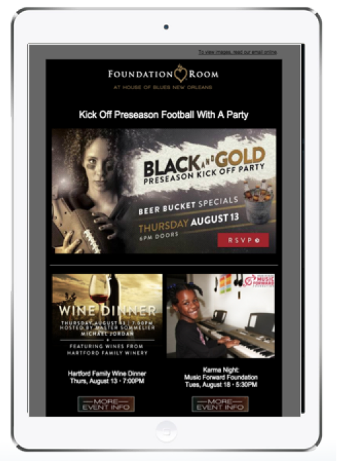
Armed with a list of templates, project timelines, initial wireframes, plus coding and design hours dog eared specifically for this project, I set up a meeting with everyone who may have something to add to the feature list and design of our new Foundation Room templates. Foundation Room is an exclusive club in some of our House of Blues venues so there were many opinions to take into consideration. To put it in perspective, at one point I recall there were 15 people in a conference room talking about one email template. After 2 months in just the design phase, and way behind schedule, I knew something needed to give. The eventual product for Foundation Room yielded not one, but two templates with a white and black background.
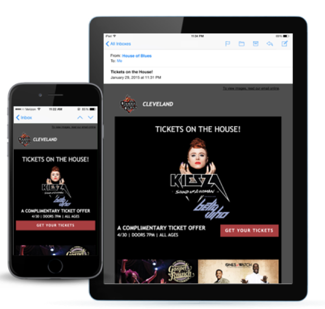
For template redesign number two we chose venue newsletters. These templates are used by local marketers who work at one of our venues across the country (45 and counting). We wanted to streamline their process as much as possible because creating an email was just one duty on a long list of both operational and digital marketing tasks. Already being far behind meant there was less time for design and feature meetings. My new plan of action was to work on a well fleshed out mock up with our amazing internal creative team, share this with the stakeholders and then turn that design over to the Salesforce Marketing Cloud services design expert to make minor edits and code. This approach worked!
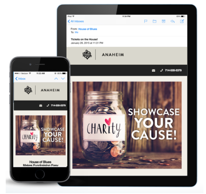
Our third template was for another internal department. They had already engaged with a vendor to revamp their website as well as create new email templates for them. While I am sure that having an established agency relationship, or working with a vendor can probably be the answer to efficiently create new templates, for us it took longer. The design lacked the specific branding elements and feel that our internal creative team accomplished, so there was more back and forth with iterations. Once coded, we again involved the Salesforce Marketing Cloud design expert to do a final check and more edits were needed.
For our final template, the path was clear. Use our internal experts for design and branding, and let the Marketing Cloud team do what they do best with the coding and Marketing cloud specific tasks, then pass it back to our email team for testing and sign off before deploying to the associated business units. This has made the lightest work for all involved and has been our process moving forward.
Before I conclude, I did want to tack on a few of the more unexpected learnings that were a result of this project.
Interested in Learning More? Check out 4 Email Practices of Marketing Masters for more insights into how to drive engagement with email.
About the Author
A self-professed data and email geek, Lydia's primary role at Live Nation's House of Blues Entertainment is to help build relationships with fans of the 45 owned and operated venues across the country. You may have seen her speak at Dreamforce or Salesforce World Tour, or perhaps met at one of the 5 Connections she had attended.


