


Get your FREE 30-day trial.
Please complete all fields.
While responsive design isn't new to email, brands continue to improve the way their messages adapt to the small screen. Since most emails show a brand's logo in the top left corner of an email, that becomes very small when scaled down on a smartphone. As a result, it's fairly common to see the logo resized or centered (or both) using responsive techniques. Here's a well-done example from the retailer ideeli: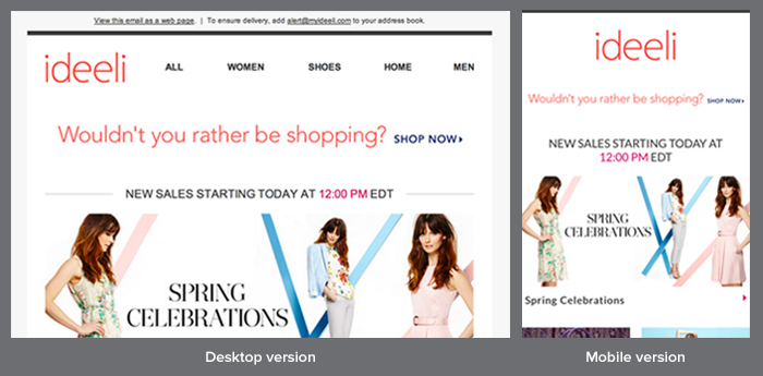
Get Inspired
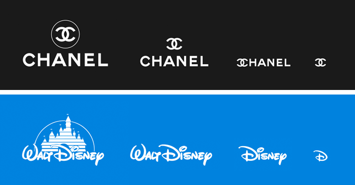
We're seeing brands adapt their logos responsively for various screen size thresholds common to laptops, tablets and smartphones, choosing to show the logo smaller, condensed or reformatted for easy recognition on a user's browser of choice. While these are just examples from one designer's personal experimentation (not in affiliation with the brands themselves in any way)-you can start to see how a logo can remain powerful, but respect the real estate available on various screens. The smallest versions could even display just a single letter or symbol-such as the iconic "D" in Disney or Cs in the Chanel logo.
While choosing one mobile breakpoint is more common in responsive email than the multiple versions common to web design, having that second, smaller version of the logo for email is a practice that is here to stay. Email real estate is especially critical on the small screen-and a brand is powerful when customers can recognize it from a fragment of the original logo. Be inspired by these logo examples and experiment with how can you adapt your email design and logo to stay recognizable and cognizant of space.
For more trends, email inspiration, and design examples, download the 2014 Best of the Email Swipe File. You can also follow the Swipe File on Twitter for more digital marketing ideas to steal, test, and make your own.


