Get your FREE 30-day trial.
Please complete all fields.
Today’s customers are expert researchers. When they visit a brand’s website for the first time, it’s a major moment of truth. The website is often the first mile marker on the customer journey — and it’s the one piece of your digital media strategy that you entirely own.
But despite the website’s importance, many ecommerce and business sites leave us feeling like we’re stuck in Internet Explorer in the 1990s. That’s not to mention poor mobile functionality or over-the-top interactive features that don’t work.
This begs the question: What does a successful website look like in 2017?
On this week’s episode of the Marketing Cloudcast — the marketing podcast from Salesforce — we’re discussing what it means to have a successful, conversion-rich website in 2017. We talked to the expert: Andy Crestodina, the co-founder and strategic director of Orbit Media and a major expert in the field of website design and strategy.

If you’re not yet a subscriber, check out the Marketing Cloudcast on iTunes, Google Play Music, Stitcher, or wherever else you listen to podcasts.
Take a listen here:
Looking for insights into improving your website from a marketing perspective? You should subscribe for the full episode, but here are a few takeaways from our conversation with the smart and entertaining Andy Crestodina.
What can companies do to ensure they’re making a good impression with their website? Andy says that it’s important to think of the first time a visitor enters your site while answering the following questions: “How well are we communicating with this visitor based on their terms? Do they know where they are immediately upon landing on the site? Are we answering their top three questions before they’re willing to become a lead or buy a product? Do we add in the evidence to support the marketing claims we’ve just made?” As Andy points out, “Sadly, a huge percentage of websites don’t even do the first of those three things well.”
“People have really vague headlines on their homepage that don’t describe what they do. People fail every day on the web to answer those primary questions—those key pieces of information that people really need. Go look at the average website and count how many marketing claims they make that are unsupported with no testimonials, statistics, or anything that builds the case or adds legitimacy,” he explains.
When asked why he thinks these faux pas have become so prevalent among brand websites, Andy says, “People fail to think of websites from the perspective of the visitor.” And they look for elements of their own marketing strategies—not what’s immediately jumping out at a viewer.
Take the navigation bar, for example. “Even though they know they need to diversify in their marketing, [websites] have navigation that says nothing specific to a search engine that will help them rank and nothing specific to a visitor that communicates what they do.”
He continues, “On every website, there’s one thing that’s visually prominent. Ask yourself: Does that headline describe to visitors what you do? Saying that you’re pioneers or #1 in your industry — these are really generic phrases that mean nothing to the visitor.”
So, what’s the most important tweak marketers can make to their sites right now to make a big improvement’? “The single most important piece of SEO real estate is the title tag on the homepage. It’s like the cover of a book. ‘Home’ is the worst possible title tag you could put on a homepage,” Andy advises.
Andy also suggests nixing the overdone testimonial page. “If you look at your analytics, you’ll see that very few people go to testimonial pages, because they smell like marketing. Get rid of that. Pull those testimonials out and put them everywhere. Make every page a testimonial page.”
His guidance: “Add evidence to every page on your site, ideally in context next to the marketing claim that it supports, and you’ll do wonders for your conversion rate.”
Faux pas aside, crafting a better website brings huge potential. “It’s so valuable to take control of this place. It’s your home. It’s a chance to really control the message and the movement of the eye. It’s the one piece of digital that you actually own,” Andy says.
So “when that person visits your site, put things in their terms.” And if you’re short on marketing hours or bandwidth, Andy suggests, “Go look at your analytics and see what’s the number one, two, and three pages on your website. Then go look at those pages from the perspective of a visitor and spruce them up a bit. Updating your website is some of the best ROI that some us can find in our day.” That means fixing things like poor mobile experiences, jargon-filled copy, and less-than-snappy headlines.
A successful website is interactive and drives sales. In Andy’s words: “Traffic times the conversion rate equals leads.”
Marketers can accomplish this by crafting “a great page about the topic, but indicate the relevance by using that phrase of that question in the title, in the header, and in the body text. That’s the heart of SEO.”
Andy’s tip for getting a higher conversion rate from your website is simple: “Answer their top questions and provide a piece of evidence to support each of your marketing claims. That’s why people take action and convert.”
Andy says it’s crucial for sales and marketing to collaborate on your website. Marketing can’t go it alone. “Through collaboration, we can produce content that speaks directly to people who are already in the funnel,” says Andy. He continues, “That kind of zero-waste marketing is only possible if sales gives topics to marketing and marketing gives content back to sales.”
We talked about much more with Andy Crestodina (@crestodina). Get the complete scoop onwebsites in this episode of the Marketing Cloudcast.
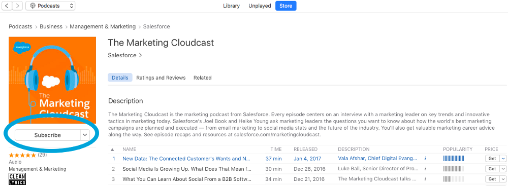
New to podcast subscriptions in iTunes? Search for “Marketing Cloudcast” in the iTunes Store and click Subscribe, as shown below.

Tweet @youngheike with marketing questions or topics you’d like to see covered next on the Marketing Cloudcast.