Get your FREE 30-day trial.
Please complete all fields.
Anyone who’s ever been lost in a convention center knows that navigating a conference, a festival, or even a large forum requires a system to untangle it all. But conference apps never quite measure up. There’s always something clunky: too many events, too cumbersome an interface, nothing intuitive to guide you to sessions or lectures you might like.
Take, for example, Dreamforce: with 170,000 registered attendees and more than 2,000 sessions and keynotes last year alone, it has always been imperative for the company to have an app to navigate the four-day event. In the past, Salesforce built a new app for each Dreamforce, a process that became more time-consuming and inefficient as the event grew.
Since Dreamforce ‘15 was the biggest one yet, we at Salesforce took a fresh approach to building out a scalable mobile event app — but we only had six months to do it. The events team wanted it to be engaging and user-friendly, with robust mobile functionality. They’d make one for iOS and one for Android, with a straightforward interface for users to see sessions and create their personalized agenda for the week. Given the time constraints, they knew they’d want to focus on solid functionality and add more features to future iterations.

An event like Dreamforce, which has 3,000 listings, presents a significant problem: there’s more going on than a user can realistically be aware of. So for this year’s Dreamforce, the goal is to anticipate what information the user will want to see, and in real time. And it must be adaptive, because people are using it when they’re on the convention floor.
They built the app using Salesforce’s Mobile SDK, which provides mechanisms for authentication services and data retrieval. With the new Events app you can:
Search for sessions by session name or by speaker
View session details, including maps and directions
View and participate in event Chatter feeds
Access your agenda and session selections
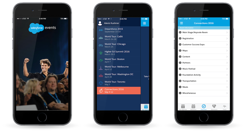
Get event details like overall schedules, venue information, transportation, meals, wifi access, and more
Navigate between multiple Salesforce events
Keld Bangsberg, Sr. Product Manager of Events Mobile Apps at Salesforce, says the team looks at three metrics when evaluating the success of the app: how many people are using it, how often are people using it, and, of course, app store reviews (4.5 stars at last count).
The Events app performed admirably and gave the team ideas for how to expand the app for use in Salesforce World Tours and other Salesforce internal and external events, including Salesforce Connections. The architecture is set, so all users have to do is populate the app with data. They don’t have to reinvent the wheel each time. “Now, all major Salesforce events can be found in one app, providing better experiences to all of our event attendees and streamlining business processes internally for all of the Salesforce employees who work on delivering our amazing events,” says Julie Liegl, Senior Vice President of Events.
Every time Salesforce adds another event to the calendar, employees can create new records for the event to accommodate speakers, rooms, AV setup, and more, and then populate the fields and set to “publish.” Instantly we can add another event to the left nav of the application. The app also incorporates the ability to survey attendees, which requires a little configuration beforehand, but allows you to send attendees of a particular session a follow-up survey.
Users get a more intuitive experience. “We wanted to have the app be your perfect companion for your event,” says Bangsberg, “accessible and ideally helping you uncover what you don’t know.”