Get your FREE 30-day trial.
Please complete all fields.
A higher conversion rate isn’t always better.
I recently wrote a post on the Convince and Convert blog about alley-oop thank you pages. An alley-oop thank you page is when you add a call-to-action on your thank you page, after someone completes an action on your site. By doing so, you can capture many leads that would have previously been left on the table. There are still so many businesses that don’t capitalize on this idea.
After writing that post and running even more tests, Max (Lesson.ly’s CEO) and I noticed something great: thank you pages were converting at an incredibly high rate. We ended up getting upwards of 40 percent of the people who downloaded something from our site to then secondarily sign up for a free trial of our learning software.
Isn't that insane? Unfortunately, we soon realized that our thank you page was converting too well.
You’re thinking, “Why would that ever be a problem?”
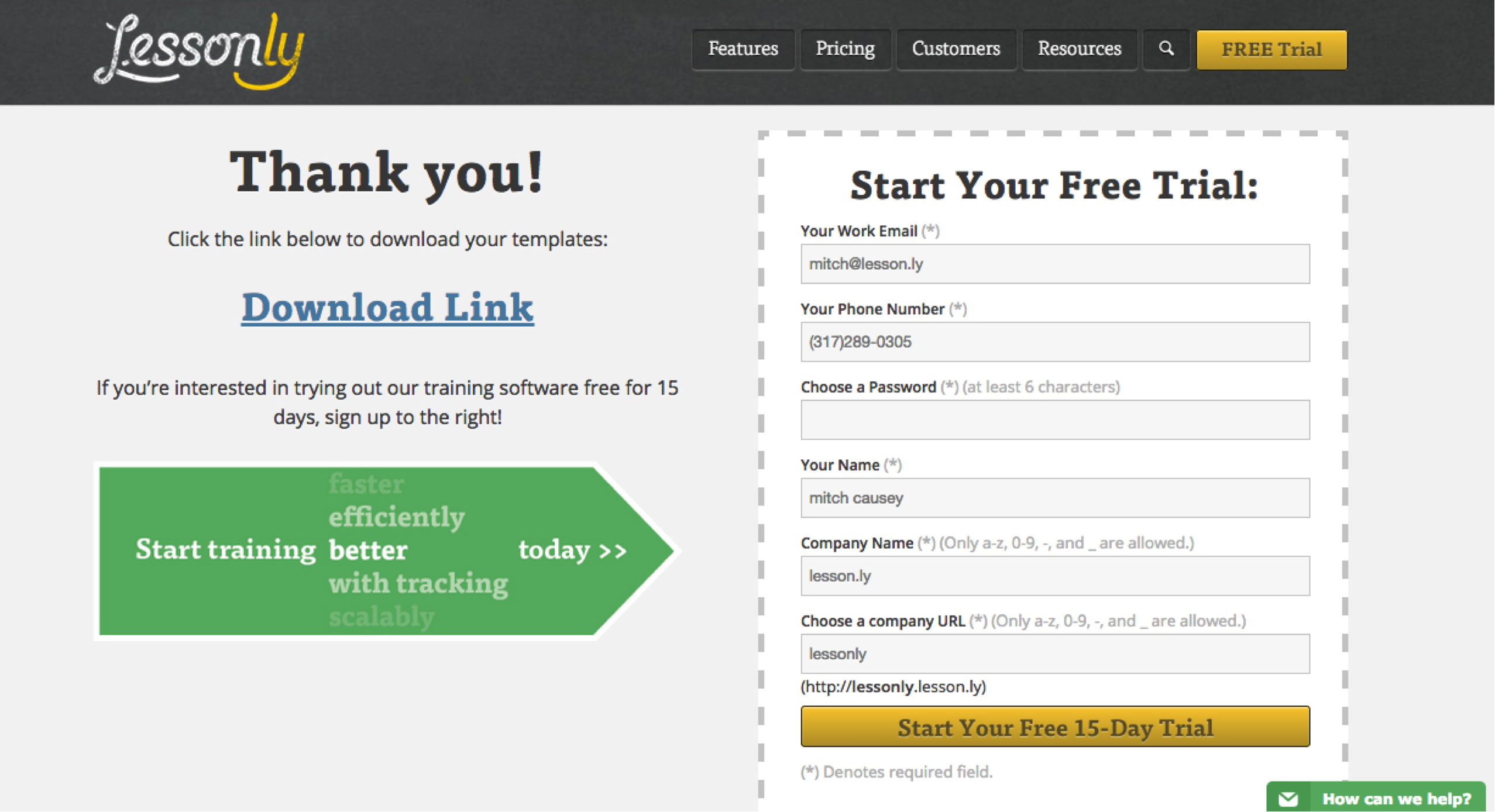
This led to skyrocketing leads—and complaints. We received complaint after complaint as we realized people were signing up for the trial because they thought they had to in order to download the content. Other people didn't even realize that they were signing up for a free trial. Even though we made this crystal clear if they were to actually read the page, people were not interested in reading and only wanted to click the big, yellow button.
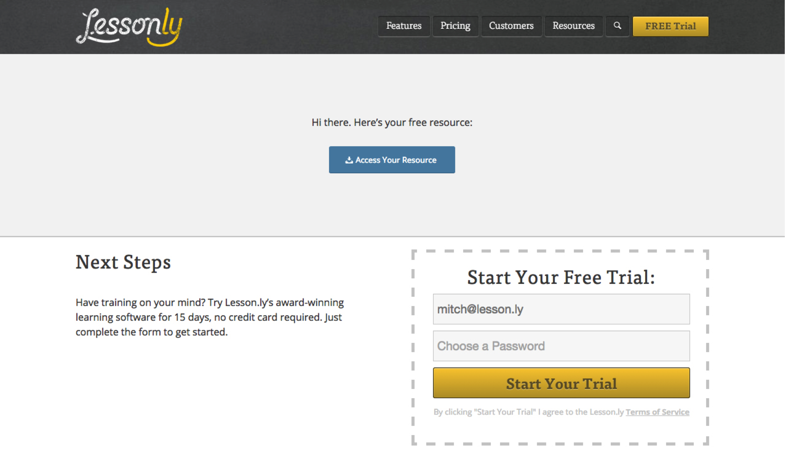
The leads were not high-quality and the people at hand felt confused or tricked. We needed a change that would continue to have a high volume of leads, but reduce the amount of unqualified ones. So, we changed the page yet again.
Old Design:

New Design:

As you can see, the biggest difference is making the “Access Your Resource” button very prominent above the fold. On that note, we kept the form just slightly creeping above the fold to entice scrolling as well. We also hid a lot of the auto populated form fields, so the trial signup felt less invasive.
Now, we have a higher volume of qualified leads and have dramatically reduced our unqualified ones.
This process takes time and effort, but I believe it highlights three important things to always remember when practicing conversion rate optimization:
Marketing is a function of sales. Our marketing team is not compensated based on the number of leads we bring in, we are here to drive revenue. I believe too many marketers have segmented themselves too far from sales. This is why you read so much about how to align marketing and sales. At Lesson.ly, there is zero line drawn in the sand between these two functions of the same process because it is just that, one process.
By aligning marketing and sales goals to the same number, which is revenue, it changes the perspective on what numbers you make decisions with.
If you believe that marketing exists to generate leads, you would've left the thank-you page how it was and simply push your sales people harder to make lemonade out of lemons. If however, you believe marketing is a function of sales and should focus on the revenue generated from marketing efforts, you quickly look further down the funnel at post-lead data, and see the obvious problem that exists.
Yes, it forces marketers to be more creative, to have more discipline, and work harder than just focusing on leads, but in my opinion, post-lead data is more important and should guide your conversion rate optimization decision process.
I fancy myself as a “knows enough to be dangerous” kind of designer. I know what tools to use and how to use them, but my design is never quite as exquisite as I need it to be. This project is a great example of that. I designed the first thank you page, the second, and the third. At each stage, the conversion rate dramatically increased, but, as I mentioned, we had so many unqualifiedly leads because my focus was solely on getting more people to push through into the next phase of our funnel.
I didn't really even consider that the user still needed to complete the task they had initially set out to do—which was to download something. I asked Max, our CEO, to help out, since one of the key building blocks to the start of his career was interactive design.
He thought about things differently. He thought we should make sure that people understand what the page is about and can make a thoughtful choice to sign up for a trial, rather than an accidental one. We came up with a solution that we thought would work. We tested it, and it is the solution that fixed the problem.
By using principles of interactive design, not just conversion rate optimization—thinking of the global user experience, rather than just fulfilling your single business objective—helped us meet both goals better simultaneously.
The final nugget I'll leave you with is what every good conversion rate optimization practitioner will tell you: Always be testing.
If you don’t continue testing your design and assumptions, you’re leaving something on the table, either more knowledge, or better leads.
The reality is, if at any point along this path, if we would have stopped testing, we would've been leaving something on the table. We would have been leaving a lot of leads for sure, but in the instance I talk about in this most recent phase, we would've left knowledge on the table.
If we would've just become frustrated with the people who couldn't figure out the form and write them off and say, “Oh, they are just ignorant,” then, well, it’d be a bit ironic. We would actually be the ignorant ones. By allowing our users to guide our thought process, in addition to our better leads, we were able to learn something new — like the three points in this article!
Have you known these three ideas to be true or false? Let me know in the comments.
Mitch Causey is the Director of Marketing at Lesson.ly, the easy learning software. Lesson.ly helps companies like Lyft, Angie’s List, and ModCloth improve their employee learning programs by allowing them to build, share, and track their materials all in one place.
Analytics can make or break how your company grows. Learn more about the state of analytics today and how you can innovate by downloading the free report.