Get your FREE 30-day trial.
Please complete all fields.
 “The emails of the future will be much more like sending subscribers a microsite than a static message,” I say at the end of my book, Email Marketing Rules. Watching videos, browsing product assortments, and even making product purchases will also be possible without leaving the inbox.
The email industry has taken another step toward this future in recent months with the discovery of a WebKit hack that lets marketers create a fully functional tabbed box or content carousel, where subscribers can click the tabs or buttons in the content block in the email to flip through different images. Our friends over at Litmus discuss how this hack is used in an email sent by UK home improvement retailer B&Q in this Email Design podcast (at the 20:47 mark).
 Beyond making for a really engaging inbox experience, this hack lets marketers place much more content above the fold, as was the case in the B&Q email and in this Mar. 9 email sent by Lego. Plus, each image in the carousel can support links to different landing pages, so it makes for smooth hand-offs to specific product or content pages.
Another great thing about this hack is that it’s compatible with responsive design. In both the B&Q and Lego emails, the approach was to have the carousel navigation buttons on the right-hand side of the content block in the desktop rendering and on the top of the content block in the mobile rendering.
This hack only works in WebKit environments, which include Apple Mail, the native iPhone email app, some Android devices, and the BlackBerry Z10. However, both of these examples also had graceful fallback renderings that showed all the content when the interactivity wasn’t supported.
Some are referring to these as “kinetic emails” because of the movement they allow, but “email carousel” is more on point since these content blocks are mimicking the carousels and image sliders that are so common on websites.
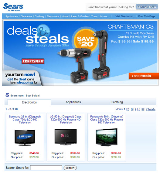
This is not the first time that this functionality has appeared in an email. In early 2010, Gmail did beta tests on a feature called “Enhanced Email” that used JavaScript to enable tabbed boxes within emails. For instance, this January 2010 Sears email below included a module with three tabs, each of which contained multiple “pages” of products that subscribers could flip through without leaving the inbox.

Rich email content like these email carousels have been slow to develop, in part because of the splintered inbox environment. However, enabling and developing this content is in the best interest of both ISPs and marketers. For inbox providers, this content keeps subscribers in inboxes longer, which is good for their advertising base. And for marketers, rich email content is consumed at a higher rate than content that’s only accessible if subscribers click through to a landing page, so subscriber engagement is boosted.
Although it may take a while, you should expect to see much more rich email content like this in the years ahead.