


Get your FREE 30-day trial.
Please complete all fields.
Where do we start with mobile optimization? We know that giving subscribers a more legible and usable experience on mobile allows them to engage and convert more easily, but how do we start down that path? Read on for tips to improve your content and design for mobile readers.
1. Gather data about your subscribers' behavior
An Email Client Analysis consulting service from ExactTarget Marketing Cloud, a Campaign Insight test from ReturnPath, or an Analytics test from Litmus will provide a breakdown of what email clients your subscribers use to open your messages -- including the percent that are opening on mobile devices. This is the best baseline from which to begin making decisions around implementing a mobile aware or responsive email solution. After seeing how many of your subscribers are mobile, weigh the pros and cons of each approach.
Benefits of a responsive approach include a truly customized and usable mobile experience, but benefits of a mobile aware approach include being able to easily use a template-based email and only having to make design changes to increase mobile usability. The greatest benefit to the mobile aware approach is that changes can be made immediately and incrementally over time. A responsive approach is long term; one that can take some time to implement.
2. Choose an approach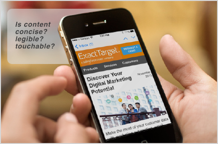
Mobile aware: Mobile aware is an approach to designing an email in a mobile friendly way. The mobile aware approach is just being aware of how the email will look on mobile devices. This approach uses design techniques only -- no advanced code. There are two main ways email is displayed on mobile devices: either it is scaled down to fit on the screen, or it is cut off with a preview pane, just showing the upper left hand corner of the email.
Tactics for this approach include:
Responsive: A responsive layout uses a piece of CSS3 code called a media query to detect the pixel size of the screen on which the email is opened. Based on the screen size detected, multiple stylesheets may be triggered to alter the layout and best respond to a particular screen size. Efficiently implemented, a responsive message allows a single set of content to be presented in the most usable format for the screen upon which the message is viewed. In email, we generalize this to include two states: large screens (i.e. Desktop) and small screens (i.e. Mobile). It is important to test your emails to ensure content is appropriately presented in all environments.
Responsive email support should be thought of in terms of software (Gmail app, Native email app, Outlook.com accessed via a mobile browser, etc.) rather than hardware or device (iPhone, HTC Galaxy, Android, etc.). Responsive email is supported on many devices, but not all. Due to Android variability in data, 82-99% of mobile opens will support media queries. (Android market share is 8% of all opens, 18% of all mobile opens) If the responsive code is not supported, a subscriber will see the standard (desktop) view of the email.
3. Create a template system, or flexible framework.
A mobile-optimized email built on a modular framework can:
Create your template (the blank shell that the email is built on) with your static header and footer content and plan a modular content approach with sections of content that can be stored separately and recombined in various iterations. Blocks of modular content turn into content areas, allowing basic editing of text and images in ExactTarget's WYSIWYG content editor. Content areas may be created and stored separately from a template, then dragged-and-dropped into the appropriate area of an email when needed. All of the elements that holistically fit together to create your templates and emails are your framework.
4. Design for mobile first
Mobile users will do anything and everything desktop users will do if it's presented in a usable way. Here are some things to think about:
Choose content for small screens:
Write concisely:
Design legibly:
Continue to implement standard images-off optimization techniques:
5. Measure your success
Tracking and conversion data will reveal how subscriber behavior or interests have changed over time. Monitor this data to respond to these changes and look at click overlays to learn if viewers are clicking where intended. Industry Benchmarks are general measures to use as a starting point. Discover what works for your audience through A/B or multi-variant testing.


