

Get your FREE 30-day trial.
Please complete all fields.
Color is more than mere personal preference. Here at Salesforce, we know that color choices affect how users perceive and process information.
And preferences aside, in two recent user studies we found that certain color combinations, or palettes, can help improve response time and accuracy:
In a recent article in Fast Co. Design, we explained what designers consider when they build interfaces for data visualizations like those you see in Einstein Analytics. So, how do the color palettes in an analytics product affect how users feel and perform? Our two recent studies may offer some clues.
Image: Examples of designs with Light, Hybrid, and Dark themes

We made the assumption that a dark color theme (right image) would be more prominent and appeal to users. Since we've used a light theme for so long we thought the novelty of a dark background would spark interest.
We had to test this assumption with real users. Our survey had questions on first impressions, preference, and value. To determine value, participants ranked charts by which theme would be most or least valuable if they had to pay for each type.
To assess performance, we measured response time and accuracy for decisions made with charts rendered in different themes and palettes. We used open text responses to understand participants’ reactions to the preference and value questions.
Our initial results showed the following patterns:
Next we took a look at the performance data. That was another story: users made faster—and just as accurate—decisions with charts in the dark theme. That's a clear edge for the dark theme.
So, as a result, our general analytics products use light themes by default. We do employ a hybrid theme in our analytics apps—created for more specific line of business goals—to help emphasize important information on the central “hero” chart(s) in the dashboard.
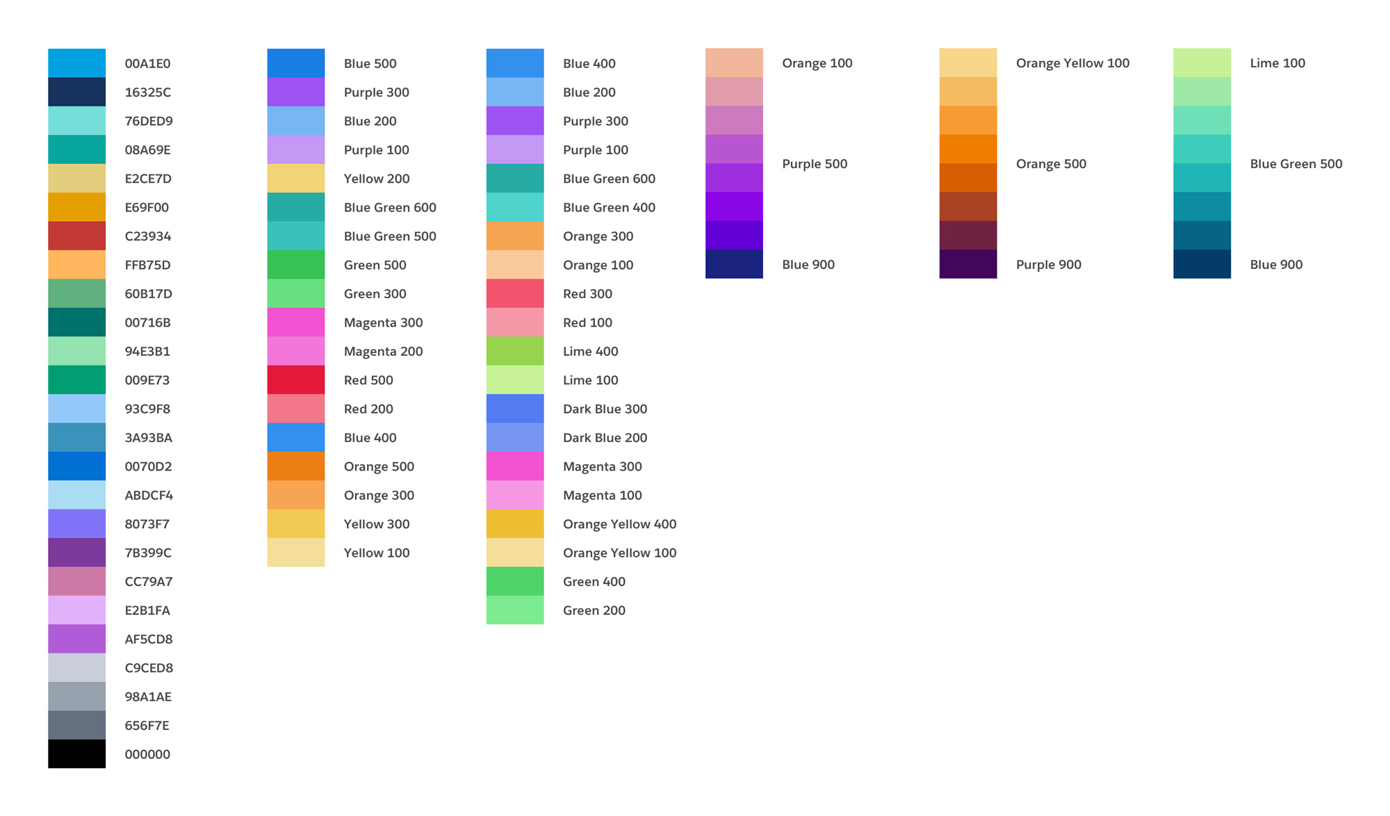
Here we thought users would prefer color palettes that represent gentle gradations of a common color—like a gradual gradient of blues and greens. We thought palettes with many different colors would seem too busy and aesthetically messy.
Study participants saw a number of charts in six different palettes that were designed to emphasize different aesthetic goals. Like with Study One participants gave us their impressions, preferences, and value feedback. We also got measurements of their decision-making speed and accuracy — just like last time.
Again, the results were different than our expectations:
We now use mid-tone hues from around the color wheel for operational reports and dashboards as well as Einstein Analytics platform charts.
Image: Examples of the 6 color palettes explored
Visual studies like these help us validate — or debunk — our assumptions and inform our product teams in their decisions on the “default” user experience (though, of course, the color themes and palettes remain customizable).
For users, it’s clear that design for aesthetic preferences and design for business performance are not necessarily the same. For designers, it’s a humbling reminder that we don’t always know what users will actually prefer. Despite what we think is best for design and performance, it's the data that wins the day.
To read more about the results of the study, check out our article on Fast Company here.
And if you'd you like to join a Salesforce study? We're always looking for users to join us — sign up to join our research panel here: https://design.secure.force.com/ux/
Image: Examples analytics app with hybrid theme to show primary charts and metrics

Image: Example of default color used for Lightning report charts