Get your FREE 30-day trial.
Please complete all fields.
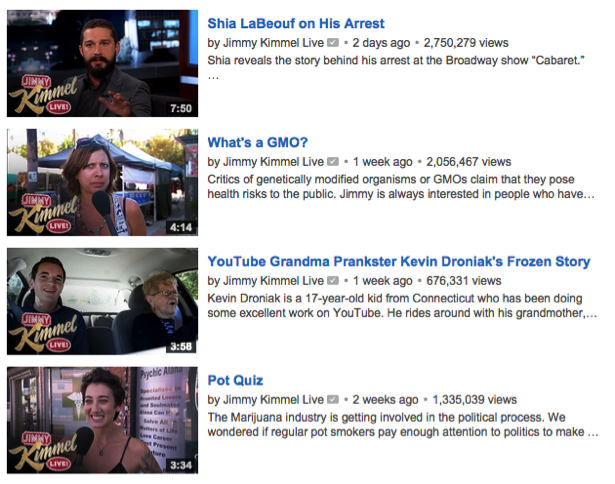
Like a movie poster or book cover, a video thumbnail is the first thing your audience sees. And while it's nice to think that we don't judge books by their covers, when it comes to video thumbnails, we do!
That's why, as digital marketers, we need to take the time to create the right video thumbnails and test their effectiveness. The right thumbnail can be the difference between someone engaging with your video content or dismissing it altogether, so making it stand out from the crowd is more crucial than you think.
By following these five best practices, you'll maximize the power of video thumbnails and ensure they do what they are supposed to do-persuade your audience to take action.
1. Faces Work Best
According to the YouTube Creator Playbook, close-up images of faces work best at attracting viewers' attention, and this can be traced back to the way our brains are wired.
As humans, we're psychologically drawn to look at other humans' faces because we have evolved to detect eye contact and to search faces for recognition, so images of people looking straight at the camera tend to work best. This can be seen in A/B testing by online retailer Eastern Mountain Sports, who found that people were more likely to click on thumbnails with an attractive person looking straight at the camera.
Faces displaying emotion are also preferred by viewers because emotion plays such a huge role in human communication. You can see this principle very clearly when looking at last year's "Christmas Miracle" video thumbnail from WestJet. It perfectly captures the optimistic, hopeful, and childlike traits the video tries to induce.

To apply these principles to your own thumbnails, first decide what type of emotion you want your video to evoke-happiness, suspicion, peacefulness-and then try to bring that emotion out in the thumbnail by using close-up, expressive, and exaggerated faces.
2. Use Bright and Contrasting Colors
Bright and contrasting colors are also preferable when choosing your video thumbnail as they make the image stand out more and draw viewers' eyes away from other videos.
 We've found that yellow in particular is a successful background color choice and gets higher click-through rates than other colors. This is apparently because humans only perceive the color yellow when both the M-Cone (Green) and L-Cone (Red) are stimulated, causing more receptors in our eyes to trigger. Perhaps this explains why taxis, school buses and caution signs are yellow.
3. Don't Forget Your Brand
Adding branding serves two purposes. Firstly, it allows viewers to associate your brand with the content, amplifying brand recognition. And secondly, it allows viewers to see that your video is the 'official' and not user-generated.
 Using professional logos and branding also makes videos seem more authoritative, as Wasp found when adding their logo to their existing videos. Surprisingly, video views almost doubled both in search results and related videos, just from adding their branding.
4. Add Text, but Only if Needed
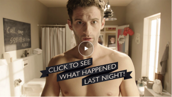
Generally, your video thumbnail should speak for itself, however, there are occasions when adding text can be beneficial, such as to clarify the content or to entice viewers to click, like the preview below.

If you do need to add text, three to six words should be your maximum and the text should help define the subject of the video. You should also take into consideration how the text will look on smaller screens.


When adding text, ensure it is large enough that it can be read when it appears on search engine results pages and that it is created with a heavy outline or contrasting colors. This will help it stand out and catch the viewer's eye.

Getting Those Clicks
When viewers search for a video online, they are presented with hundreds of options on the same topic. So for your best shot at getting noticed, you need to make sure your thumbnails are clear, bright, high-resolution, and engaging.

While these tips are a great starting point, every industry is different and figuring out what type of video thumbnail works best may take a bit of trial and error, so the key is to experiment via A/B testing. Just remember, when conducting your A/B testing, use a range of distinctly different images, even if you think some won't work, because you may just surprise yourself.
Then once you've settled on your winning formula, don't feel shy about using it on each video you produce. If you look at successful YouTube channels, you will notice that most of their thumbnails are almost identical. Creators have figured out exactly what works best for their viewers - and they're willing to use it again and again.
Colin Osing has been marketing products & solutions in cloud-based businesses and online media since 1999 working at both startups and enterprise-level businesses. He's currently VP of Marketing at SoMedia Networks, responsible for the overall marketing strategy of SoMedia's Scalable Video Production solutions including branding, product marketing, demand generation, and all things online. SoMedia Networks is a Salesforce Marketing Cloud HubExchange partner. Their Scalable Vide HubExchange app provides a complete solution for all your video needs. Check out their HubExchange app today!