


Get your FREE 30-day trial.
Please complete all fields.

 The ongoing U.S. presidential race is the hottest topic on
any news website or social media (maybe except in San Francisco where everybody
is talking about Giants baseball).
The ongoing U.S. presidential race is the hottest topic on
any news website or social media (maybe except in San Francisco where everybody
is talking about Giants baseball).
The one issue with this media takeover is that there is so much information, that it’s hard to make sense of it. We thought about this and a bulb went off: our Marketing Cloud product already aggregates and analyzes incredible amounts of data when it comes to commercial brands – why not apply this same treatment to a large event like the U.S. election and see what happens.
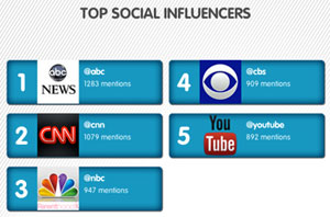
We put the Marketing Cloud analytics to work and soon we had a phenomenal collection of data, highlighting the share of conversation per candidate, top influencers, most popular topics, and much more. To make this easily sharable, we mixed in some Salesforce Platform magic and created a real-time infographic, which displays a snapshot of the latest election developments.
Below is a still capture of the infographic and you can see the interactive version which updates in real-time on our website: http://www.salesforce.com/election12
(You can read more about how we put the infographic together once you scroll to the bottom of the image)
In case you are curious about the process of creating this
live infographic, here is how we went about it:
1. We used the Marketing Cloud to set up “topic
profiles” – this means creating different data search profiles based on a
collection of relevant keywords (eg. Romney, Obama, debate, and so on). One of
the topic profiles is searching and pulling any social media mentions for the
two campaigns across social and mainstream media. The other is analyzing what
issues and topics that people were discussing in relation to the election –
e.g. taxes, foreign policy, the economy.
2. To avoid any bias, we made sure that each topic
profile had exact the same keywords, relevant to each campaign.
3. After we pulled the topic profiles, we decided
to visualize the data in different widgets. We thought that share of
conversation, top social influencers, conversations by topic, quantity of
conversations for each candidate, and most popular keywords and hashtags was
the way to go.
4. The next step was integrating all this
information into a “living and breathing” infographic. To do that we used the
power of the Salesforce Platform, and created the app which makes API calls to
Marketing Cloud, pulls the relevant information in real time for each widget
and then displays each widget.
5. Some interesting observations of the data over time:
- If you look at the "number of conversations over
time" widget, you will notice four clear conversation peaks. Those peaks are due
to the 3 presidential and one vice-presidential debate.
- If you observe the number of conversations per
topic, you can see how the data shifts daily. Before the final debate for
example, foreign policy was towards the bottom of the topic list and now is at
the top.
This visualization of social media information can be easily applied to any event or your brand. This way you can easily follow how the social media conversation around your brand is evolving and who is influencing the discussion.
Follow @marketingcloud for more tips and case studies on social media measurement.
Measuring your initiatives is an important aspect of understanding how your social media efforts are performing, but many find it difficult to identify the specific metrics they need. But rest assured, there is a way. In this ebook, you’ll find step-by-step processes and explanations for establishing metrics that help you track the progress of your social media efforts.


