Get your FREE 30-day trial.
Please complete all fields.

In France, the Presidential Election touches everyone, and lately, so does social media. Out of the 66 million people living in the country, 75% surf the web and 25 million have Facebook accounts. About 43 million are eligible voters. As you can see, having a big presence on social media is something that candidates cannot afford to ignore.
As a matter of fact, for the first time in French history, every presidential candidate has setup Twitter and Facebook accounts in order to connect with the voters.
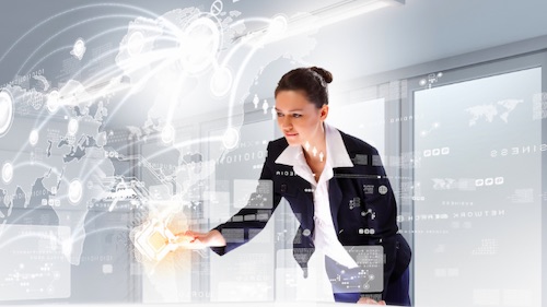
Considering the significance of this, we wanted to come up with a innovative way to analyze and share the social buzz about the elections. What are the French people saying about the elections, which candidates are they talking about, and what is the impact of all the buzz?
Here is the solution we came up with:
http://www.salesforce.com/election2012
And now let me share the backstory…
LeWeb'11
Everything started last year during the international internet conference "LeWeb11," lead by Loic Le Meur. Our salesforce.com team wanted to make the conference experience even more social so we set up large screens displaying real-time social analysis of LeWeb. Thanks to the Radian6 functionality, we were able to show which event speaker got the most mentions, what were the big highlights of the day, what was the volume of conversations, the top hashtags used. You can still access these reports here.
After this first success, we wanted to do something bigger and even more impactful. The French Presidential Election was the perfect opportunity for this!
Working out the concept
After some brainstorming, we decided the most meaningful and relevant approach would be to show Radian6 data in real-time. This would allow visitors to come back to the application and check the impact of an event immediately, or follow what's going on at the moment just by observing the real-time graphs. We think that this would be the future of social engagement, not because it is trendy or popular, but because it's very useful and timely from the perspective of the user.
The actual application was developed using Radian6, Heroku, and Ruby on Rails. The advantage of Heroku here was mainly the flexibility. It allowed us to increase the number of clusters depending on the number of visits that we get. The simplicity to write the code in Ruby on Rails was also very important to us.
Finally, we integrated the app with our French Facebook page in order to increase awareness, and show users that a B2B company can also talk to its customers in an accessible and relevant way. (At the moment, French consider Facebook as mostly a B2C platform and there are very few B2B users...But times are changing fast!)
Since the infographic is in French, here are come clarifications of the content:
The first graph is about the evolution of conversations in the last 15 days per candidate. What is interesting here is that every time a candidate is giving a speech, or doing a small event, you can see the impact immediately. You can also see quickly which candidate is well-mentioned on social networks and the ones who are not.

On this screenshot, we can see the impact of the first round of the election. During the election day, announcing the results before 8pm is forbidden. Any mention of the election results will be “punished.” A big gap appears here compared to the following day when discussion is permitted again and we see a big peek of 30,000 mentions per candidate.
The next number is the number of mentions around the elections since January 1st of this year. For example, in the 20 days before the first round of election there were more than 800,000 mentions – believe me this is insane for a country like France.

The next graph on the left is the number of conversations per candidate in the previous 48 hours, which allows you to see share of conversation each candidate gets.
The influencers box contains 2 graphs: the first showing the top 5 twitter accounts, and the second showing the top 5 blogs which are the most influential about the presidential elections.

The graph afterwards has the number of conversations per topic in the last 7 days. It is always interesting to see what issues people are the most interested in, what they care about, and what they expect from the next President.

 And finally, the last two are word clouds, containing the keywords and hashtags most used during the last 24 hours. These ones are changing quite a lot and reflect what’s trending in France at the moment.
To engage more with our visitors, we added a comment module at the end to ask people to give their opinions and any feedback on what we could improve next time.
The big difference between this infographic and all the standard ones (with a two day self life) is the fact that people are coming back repeatedly to see the refreshed results. The real-time aspect is creating value and allowing visitors to follow closely the election trends.
And you, what do you think about the connection between social media and elections? Is this a good predictor of who is going to win? Do you think that the future president should be a social media influencer?