Get your FREE 30-day trial.
Please complete all fields.
We recently announced the new Salesforce Lightning Experience. It’s a completely re-imagined user experience designed to maximize sales rep productivity, and it is backed by a robust and flexible platform. While we are incredibly excited about this latest release of Salesforce, we are also very excited by what grew out of the Salesforce Lightning effort, specifically the Lightning Design System.
Salesforce has always been committed to customer success and that’s why we are the world’s leading CRM solution. We got here by listening to and responding to our customer’s needs. As a result, our teams were often optimized to meet those needs within specific product features and areas.
But in order for us to succeed in re-inventing our experience, we needed to look across product areas and business units. We needed to break the mold and create new, best-in-class experiences that could scale across the entire organization and beyond.
It’s important for my team to always remember that Salesforce is both an app and a platform. That means our approach to design needs to take into account not only what the best app experience is for a particular problem, but also how that experience can scale and be customized to solve other problems we haven’t even anticipated. This is where the Salesforce partner and developer community really shines.
With the Design System, we figured out a way to make it as easy as possible for our development teams to create modern, usable, scalable, accessible, and beautiful user experiences. The Design System is how we communicated effectively and created consistency around the new Lightning Experience. Instead of communicating our design through static documentation, we used living code.
The Design System is based on our four design principles:
Clarity
Eliminate ambiguity. Enable people to see, understand, and act with confidence.

Efficiency
Streamline and optimize workflows. Intelligently anticipate needs to help people work better, smarter, and faster.

Consistency
Create familiarity and strengthen intuition by applying the same solution to the same problem.

Beauty
Demonstrate respect for people’s time and attention through thoughtful and elegant craftsmanship.

All four of these design principles have been translated into extensible Cascading Style Sheets (CSS). And here’s the best part. We’re taking all this expertise and all the tools we used internally, and opening them up through our Design System so you can also have access to what we have inside Salesforce.
You can think of the Design System as a how-to manual that enables developers and partners to build beautiful components that work with Salesforce across devices and operating systems. It’s a living style guide and best practices, married to code.

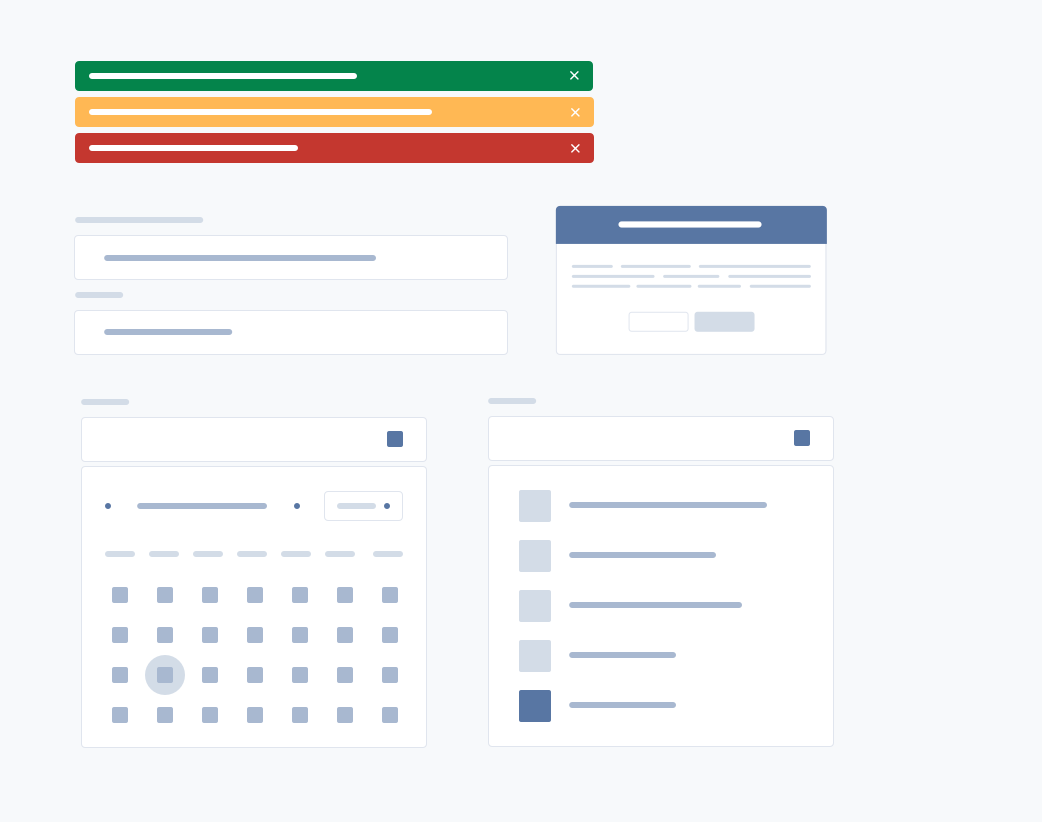
With the Design System, we’re making it easy for partners and ISVs to match Salesforce’s look and feel. What you’ll see is our UX broken down into easily consumable and reusable components. Those components can be taken and applied to your business cases to build your own custom solutions.
While style guides look backward and are out of date as soon as they are released, design systems look forward. When we update our UX, there is no need to worry about opening code and changing values by hand. Partners and ISVs can just point to the Design System. It is always current.
The Salesforce Lightning Design System is laying the foundation for continually improving our design and our processes. This is a different way for us to operate and no one else in the enterprise space is doing this. We think it’s going to be awesome, but we’re also learning and improving. We really want to know what works and what doesn’t work for you, so please give us feedback. The more feedback we get, the better it will become.
Create the world’s best enterprise app experiences with the Salesforce Lightning Design System.
