Get your FREE 30-day trial.
Please complete all fields.
Every once in a while you get an opportunity to work on something that changes the game. Something that is hard and risky and meaningful. Something that when you are being honest with yourself makes you scared. For me this was — and still kind of is — a scary project. So it’s especially gratifying professionally and personally to introduce you to Salesforce Lightning.
Salesforce is the leader in CRM. We have more than 150,000 customers and millions of users, and all of them wanted basically one simple thing: a new, more modern user experience. We have listened to, studied, and considered all of the feedback, and put together a completely new CRM experience that is going to accelerate adoption and value for every Salesforce customer and end user.
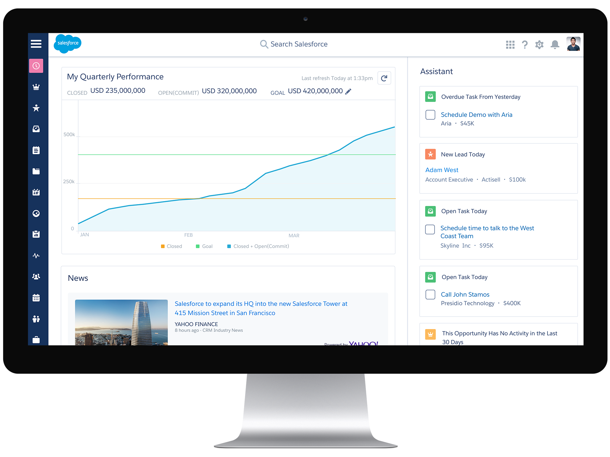
This launch is not just about new fonts and colors and icons. And it’s about much more than a refreshed user interface. Lightning Experience is a completely new Salesforce and a completely new way to sell. It’s a re-imagined platform designed to maximize sales rep productivity, complete with analytics and in-line intelligence that will drive sales precision.
Lightning Experience has been a multi-year mission for Salesforce. We started with the Salesforce1 Mobile App, and its underlying Lightning framework, both of which gave us the foundation to re-imagine our desktop experience. We asked ourselves, “If we were back in 1999, but had all of the technology available we have today, what CRM would we build?” The result is Lightning. It’s not just a great new user experience. It’s also packed with new features to help you sell faster, work more productively, and make better decisions.

Our initial focus in designing Lightning Experience was to improve the core sales features sales people use everyday. We’ve talked to thousands of salespeople and they told us what they want most: tools that can make them more productive and drive their business forward faster. We set out to build an application that has a point of view on sales and drives new levels of efficiency, versus just a database for tracking contact information.
Here are a few of my favorite features that I think make this goal a reality:
Activity Feed: Salespeople want to know two things, what just happened in an account and what they need to do next. The Activity Feed does just that.
Contextual Hovers: You can now see everything going on with a customer without going to different pages in the application.
Opportunity Board: This new feature gives you the complete picture across all of your deals. You can drag-and-drop deals from stage to stage like digital sticky notes.
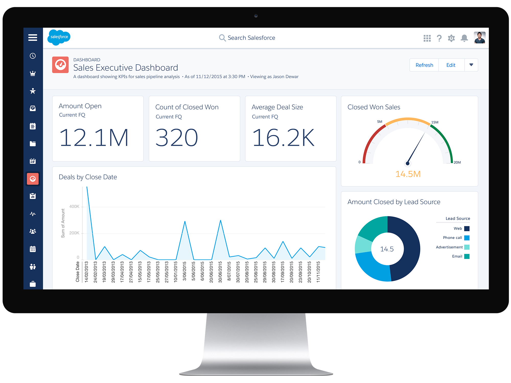
Customizable Dashboards: Dashboards are available with more than three columns — in fact, you can have up to nine. This was one of the top most requested customer features on IdeaExchange.
This list is just a sample. There are more than 55 re-imagined Sales Cloud pages and 25 completely new features launching with this release. It’s unlike any we’ve done before.

As with all new features of our Customer Success Platform, Lightning will become instantly available October 17th with the release of Winter ‘16. Your existing configurations don’t have to change. Additionally, you have control over the roll-out strategy for your organization, as admins can enable Lightning Experience access at the user, profile, and organization level.
You can test and validate Lightning, especially any Visualforce you have written. Evaluate how Lightning works for your organization and the business processes you manage with Salesforce. You will also want to evaluate how each AppExchange application you use is evolving to Lightning.
Admins can take advantage of the new CRM trail on Trailhead, our interactive learning platform, to learn about Lightning Experience features, plus get tips on how to plan their implementations and communicate the roll-out to their company. There is even a new developer trail for learning how to create Lightning Components, building with Lightning App Builder and Visualforce, and making all of your apps modern and beautiful with the new Lightning Design System.

Today marks the start of a process that each and every customer will undergo to learn about, evaluate, and then plan a migration to the Lightning Experience. Please try it out. We hope that you love it and we hope that you will keep on telling us how to make it even better. This product is based on all of your feedback and it’s your feedback and energy that will help us continue to improve it going forward.
With the Salesforce Blog weekly digest, you’re always up-to-date on the top blog posts and latest we publish. Subscribe here!