

This is the fourth in a series of blog posts on UX best practices. The series shows how you can increase revenue by optimizing the customer experience — from page design to payment. Read the previous, UX Best Practices: The Product Detail Page.
Imagine walking into a retail store and being unable to find what you want; products may be haphazardly arranged, or you may be overwhelmed with too many choices, and there is no one to guide you. You leave, frustrated, and the retailer loses a sale. This is precisely what happens online when shoppers can’t find what they’re looking for. The culprit? Oftentimes, bad navigation.
Navigation is, of course, a critical tool in the online shopper journey. Poor organization, an overabundance of category links, and usability issues can easily frustrate shoppers and lead to abandonment. Your navigation should provide a high-level overview of what you offer, and get shoppers to the product they are looking for quickly. Designing effective navigation requires a balance between catalog architecture, merchandising strategy, brand goals, and user experience design. Consumer trends in mobile shopping – our latest Shopping Index shows enormous growth in mobile traffic and orders – also present additional considerations designers must take into account.
How you organize and design your navigation is highly dependent on your business and the size of your product catalog. What works for one brand or retailer may not work for another. Be sure to test the impact that changes to your navigation will have on your KPIs: examine crucial metrics like abandonment, add-to-cart rate, conversion, increases/decreases in search usage, and time on site.
The following best practices are based on the review of thousands of retail websites, extensive heat mapping studies, Commerce Cloud benchmarking data, and industry statistics. Take these general best practices into consideration as you look to optimize your navigation in a way that makes sense for your business.
Best practices for mobile navigation
Designing for touchscreens brings about a whole different set of UX best practices when compared with web. Mobile and desktop sites should be visually consistent so multi-device shoppers are comfortable and confident picking up where they left off, but desktop and mobile navigation should not be identical. The needs of mobile shoppers are wholly unique, and navigation should reflect that. Check your current mobile navigation against these design best practices:
Category hierarchy: broad or deep?
Your navigation should guide the customer to the product they are looking for and help them discover new products along the way. When deciding how deep to go with the sub-categories in your navigation, consider the size of your product catalog, buyer context, and your target market’s shopping behavior.
If your product assortment is relatively small, you may benefit from high level navigation options. Rather than pushing shoppers to narrow categories with fewer products, you can increase product discovery by using broader categories. Filtering options within broad categories will help the customer further narrow product choices.

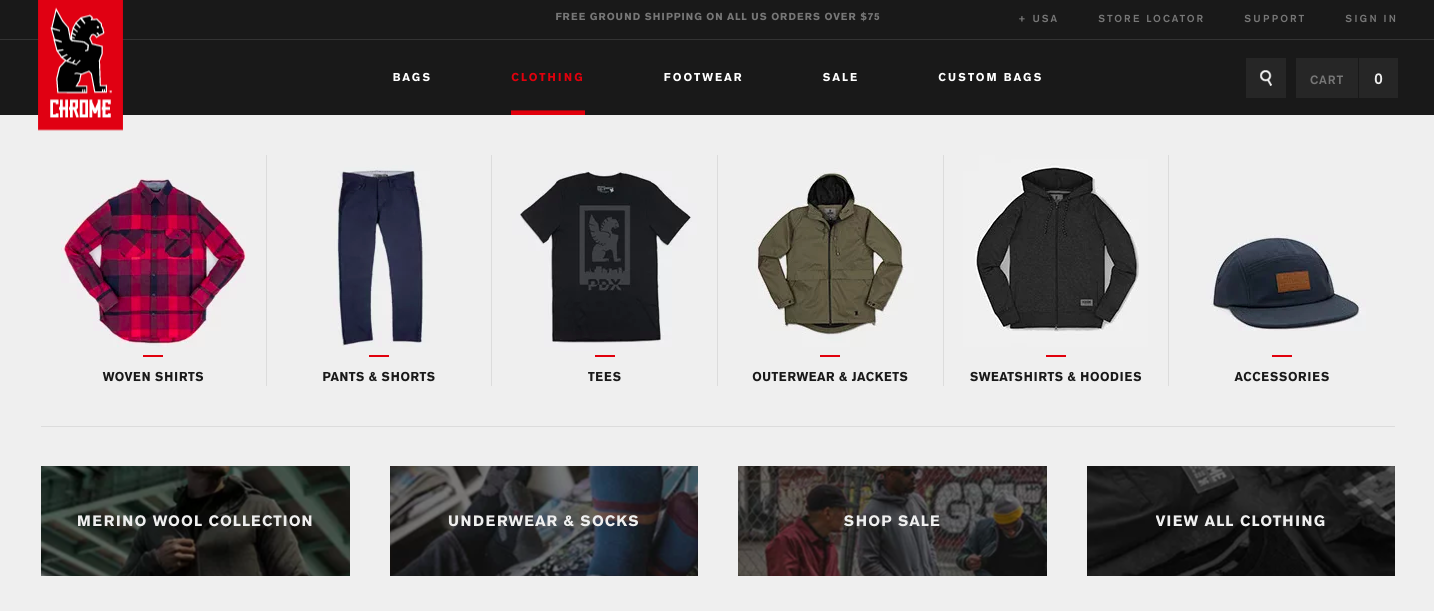
Chrome Industries (above) has a relatively small product catalog and uses parent categories (woven shirts, tees, etc.) in navigation.
On the other hand, if your product assortment is wide, you may benefit from using narrower sub-categories within your navigation to get shoppers to a product quicker. However, be mindful of overwhelming shoppers with too many sub-category links, which can lead to frustration and abandonment.
The Converse site below shows navigation drilled down to deep category results, which reduces the number of page loads and additional filtering required of the shopper. Shoppers can get to products quicker, which is especially important on mobile where, according to Commerce Cloud data, the average session is 6.8 page views.

While adding more sub-categories might seem like a reasonable tactic to help shoppers find what they are looking for, it can actually hurt add-to-cart rates. Commerce Cloud benchmark data reveals that sites with more than eight categories see an add-to-cart rate of approximately 3-8%, while sites with 6-8 categories have an average add-to-cart rate of 11%.
Best practices for mega menus on desktop
Mega menus, a type of expandable menu in which links are displayed in a two-dimensional dropdown layout, have popular with designers because they can accommodate a lot of links. However, this doesn’t mean they are always user-friendly. Small design tweaks can help shoppers more efficiently browse through mega menus:

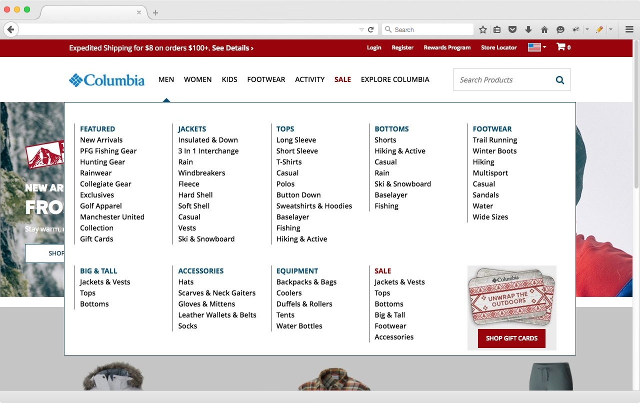
As you can see, Columbia Sportswear has a lot of categories and sub-categories in their mega nav, but their navigation is completely above the fold and easy to read thanks to whitespace, leading boundary lines, and font styling.
Product findability is critical to an ecommerce business. If shoppers can’t find the product they are looking for, they can’t buy it. Use the best practice guidelines outlined here, and revisit your navigation on mobile and desktop. Look for opportunities to optimize and be sure to test any changes you implement. Small optimizations to improve usability can have a big impact on the shopping experience, and ultimately sales.
Want even more? Read our next post in the series: UX Best Practices: The Checkout Flow