Get your FREE 30-day trial.
Please complete all fields.
Lightning Experience is Salesforce’s most beautiful product. But being beautiful isn’t enough. We’re an enterprise company that recognizes the world has changed, and good design isn’t just for consumer companies. That’s why this new desktop user experience is also the best design work we’ve ever done.
When Apple released the first iPhone in 2007, the enterprise world was skeptical and cautious. Blackberry was the gold standard in enterprise mobility, with robust security and admin tools that gave corporations tremendous control. Yet whether or not Apple was gunning for enterprise adoption in the early days, it got it in droves.
That’s because people really enjoyed using their iPhones. They started to bring them to the office to get real work done. They started demanding more from their IT departments. No longer were employees, customers, and partners going to tolerate subpar experiences.
At the same time, Salesforce went into hyper-growth mode, and we wanted to scale across the entire organization in an effective way. We needed our product teams to not only optimize for each local feature area, but to also think about the bigger picture.
To build Lightning Experience, we had to think about the UX holistically, so we took our solutions and best practices and created a living design system. The Salesforce Lightning Design System is a collection of design patterns, components, and guidelines for creating unified UI in the Salesforce ecosystem. It’s open source and free to everyone.
This has been a long journey — and we're still learning. For now, here is our ever-improving process:
For years, we wanted to redesign the Salesforce desktop experience. But that goal was simply too broad to be meaningful. We needed to first ask what would constitute a good design. Looking "new" or "modern" wouldn't be enough. There had to be a common understanding around what the desired outcome of the new design was for the user, the customer, and the business.
Once we agreed the focus was on making sales reps more productive, we were able to make genuine progress on a new UX. Aligning around this goal allowed us to make decisions and agree on what success would look like.

At Salesforce, we return to our four design principles — clarity, efficiency, consistency, and beauty — repeatedly. They help us prioritize and make tough calls. They can save literally hundreds of collective hours of deliberation.
At one point, while designing Lightning Experience, there was a big debate over how we should label a feature. Hours and hours were spent discussing the merits of one label versus another. Sleep was lost. Then we decided that to figure it out, we needed to go back to basics and back to our design principles.
Our question came down to whether we were comfortable with some inconsistency in the naming convention of two similar features, or if the inconsistent label's clarity for users in that particular context outweighed the negatives of an inconsistent name. Clarity is design principle #1, consistency is #3. Decision made.

Ultimately, the biggest challenge of any large and complex project is communication. It's the root of nearly all scale problems. These are a few tools, assets and processes that eased communication within our design team:
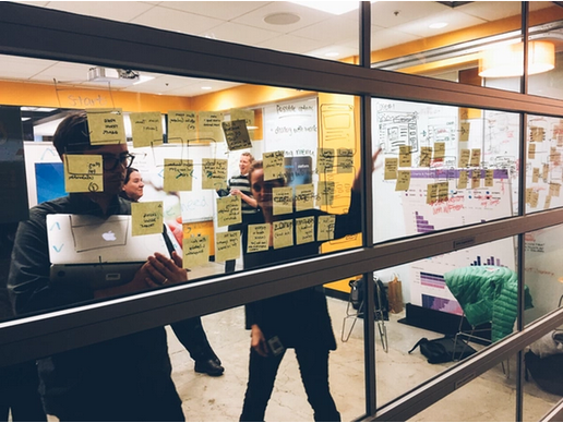
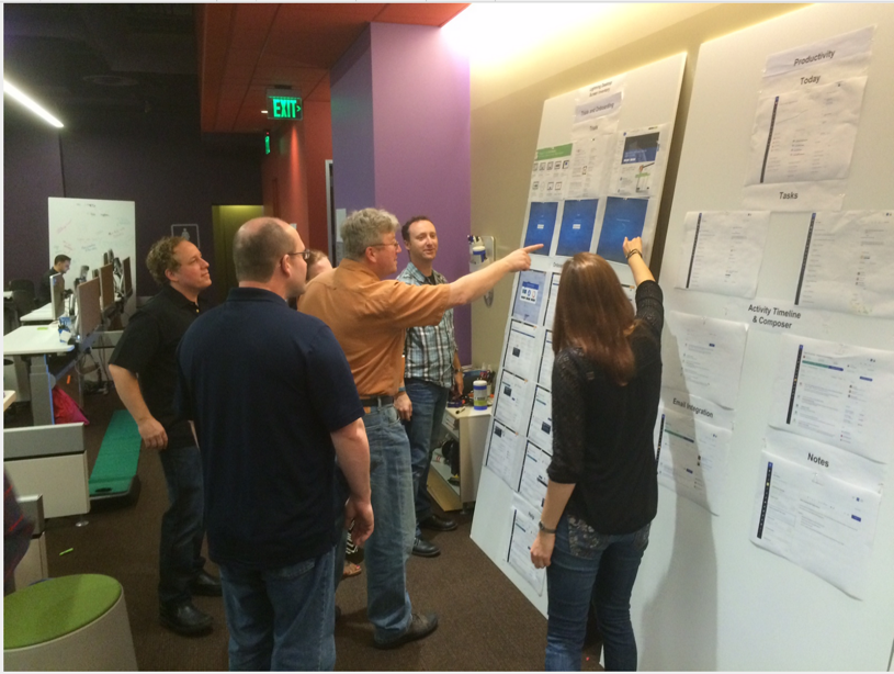
Get it on the walls. Teams need to see the end goal in order to keep marching toward it effectively. We printed out all of the key screens and put them everywhere there were product teams; multiple floors, kitchens, and meeting rooms. We even thought about putting them in the elevators.
Have more than a static style guide. The Salesforce Lightning Design System is our living style guide that makes doing the right thing also the easiest thing. We define our styles using code. They are flexible. The intent is for them to evolve to our needs, quickly.
When in doubt, talk it out. A natural distance and resistance can set in once you get to a certain size and can’t see everyone’s face. Be a collaboration zealot and seek out people to settle misunderstandings and disagreements in real time.
Remember, leaders are repeaters. Just when you think you have repeated the message one too many times, and you're tired of hearing yourself talk, you've just gotten started.

It’s vital to use all of the above to act, because indecisiveness can lead to debt. The more decisions you put off, and the longer you delay them, the more expensive they become. Even if you make the wrong decision, in most cases, it's cheaper to course correct than it is to delay.
My boss likes to say that projects are like big ships, nearly impossible to turn in the right direction if they are not moving. So get moving. When you do need to course correct -- and at some point you will -- you'll be glad you put all these processes in place for easing communication and improving collaboration.
To try out the Salesforce Lightning Design System, click here.