


Get your FREE 30-day trial.
Please complete all fields.
This is the second in a series of blog posts on UX best practices. The series shows how you can increase revenue by optimizing the customer experience — from page design to payment. Read the previous, UX Best Practices: 5 Tips from an Expert Who's Done Thousands of Retail Site Audits.
There are few things more important to an online brand than a well-designed homepage. All at once, this front door to your business must be attractive, convey the essence of the brand, convey what actions a visitor should take and, of course, be simple to navigate. Oh, and it needs to do all that in just a few seconds.
This is important not only for aesthetic purposes but also for the business. A well-designed and thought-out homepage can lead a shopper down the path to purchase and drive sales.
As a user experience expert at Commerce Cloud, I work with global brands to establish best practices, based on extensive heatmapping studies, industry statistics, and our own benchmarking data. One question we get from our customers over and over is what works in terms of UX. That’s why we’ve kicked off a three-part UX webinar series.
Striking a balance between brand and commerce goals on the homepage can be a challenge. Understanding shopper behavior and homepage best practices, based on data, can help you prioritize messaging and optimize usability. Keep in mind, what works for one retailer may not work for another. That’s why A/B testing is always recommended to optimize metrics and the shopper experience for your target consumer.
The following homepage UX best practices are based on the review of thousands of websites, extensive heat mapping studies, Commerce Cloud benchmarking data, and industry statistics.
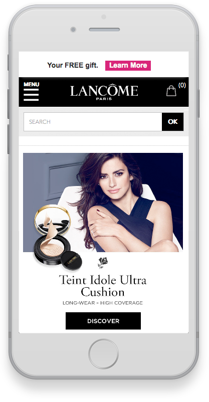
Optimize homepage banners for mobile
Best Practice: Consider how content will render on mobile. Create mobile-specific banners, use text overlay rather than embedded text on images, and compress file sizes to 40K or below for optimal page load.
We continue to see brands simply simply shrink banners designed for a web experience down for mobile, with embedded text and images. Do not do this! Banners designed for desktop will almost always perform slower on mobile, and therefore present your prospective shoppers with an open invitation to jump ship. There are also visual drawbacks to simply scaling desktop banners for mobile which include:
• Text and images that become fuzzy and hard to read when scaled
• Tappable elements and calls to action that become difficult to interact with
When designing for mobile keep these banner best practices in mind:
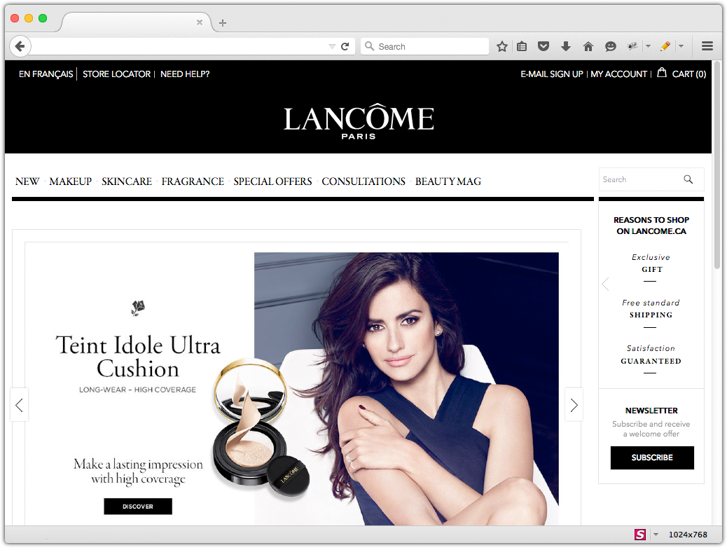
Think about browser height and available space
Best Practice: Design for the average user’s screen size and use available space wisely.
As of January 2018, 51% of Web browsers have a height of 800 pixels or less. When thinking about available homepage real estate, you really only have about 664 pixels in height to work with. Unfortunately, you lose a little over 100 pixels of screen space to the actual browser, and the average header is anywhere from 120 to 160 pixels. That doesn’t leave much real estate.
Consider homepage scroll rate
Best Practice: Keep key messages and calls to action above the fold.
Be cognizant of where key elements are positioned on the page, and the impact that placement has on shopper behavior. For example, we know that mobile users scroll further down the page than desktop users, which may be because scrolling is a natural motion on a touch device. Plus, mobile users understand that they have to scroll down to get to content and products.
Observations from heat map studies have proven that there is a dramatic drop off rate in scrolling when users approach the fold:
• An average of 30% of visitors do not scroll below the first slot on a typical homepage
• On average, only 10% of visitors scroll all the way to the footer
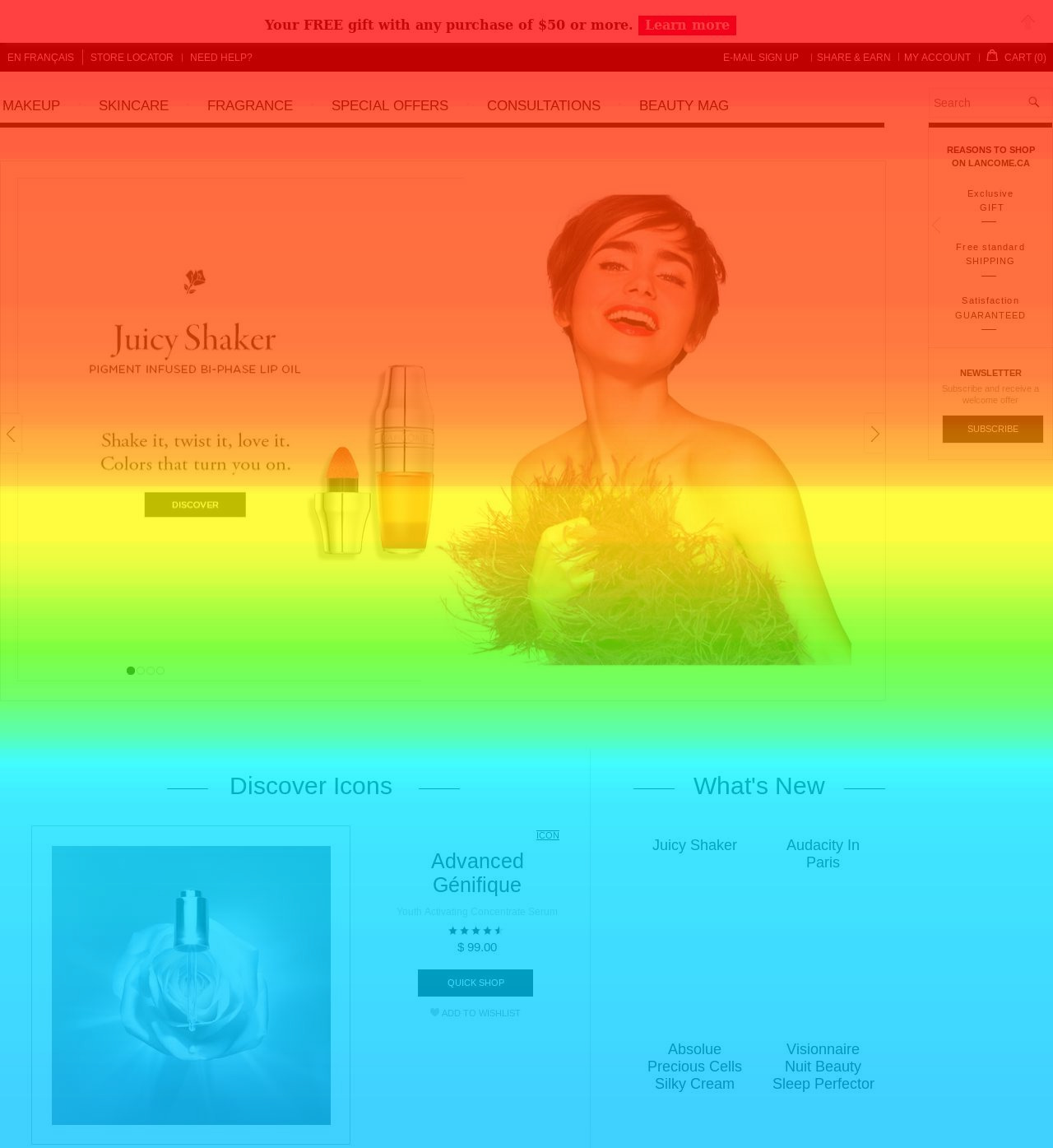
70% of shoppers scroll to this point (green/yellow)
43% of shoppers scroll to this point (blue)
The bottom line is this – key messages and calls to action are best placed above the fold whenever possible. This is not to suggest that everything needs to be cramped above the fold. The goal is smart, balanced design where placement of key messages and calls to action are well thought out.
Also consider where you place secondary features such as product recommendations, social media feeds and other elements. The lower on the page, the lower the view rate; however this does not necessarily mean a lower click rate. The quality of the content and design will influence click rate as you move down the page.
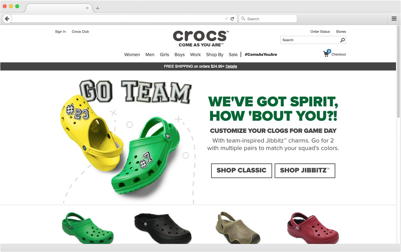
Check height of homepage content slots
Best Practice: Make the second row of content partially visible above the fold on most screen sizes.
Designers have the opportunity to maximize content exposure on the homepage by being strategic about the height of homepage content slots. Heat map studies show an increase in scroll rate when the first slot does not consume the entire page. When a second row of content is partially visible, it serves as an indicator that there’s more on the page – and this encourages further scrolling. See the below example.
Want even more? Read our next post in the series: UX Best Practices: The Product Detail Page


