

Get your FREE 30-day trial.
Please complete all fields.
This is the first in a series of blog posts on UX best practices. The series shows how you can increase revenue by optimizing the customer experience — from page design to payment.
As a Principal Success Specialist at Salesforce Commerce Cloud, I spend a lot of time assessing the usability of global brands’ websites, and making recommendations on how they can improve. Specifically, I look at how easy is it to navigate, discover products, and get through the checkout process. One mistake I see brands make again and again is that they fail to get the basics right.
All too often we hear brands say they want to be innovative. This well-intentioned goal can often get in the way if you don’t first get the basics right. If, upon visiting your site, shoppers encounter disorganization, clutter, bad navigation and search, they will quickly become frustrated and check out (and we don’t mean “check out” in a good way).
Some of the best-performing sites we see have common attributes: it's easy to find products, add them to the cart, and checkout. These sites take a simple approach, and have solidified the core functionality, the basic foundation, of ecommerce. Most of all, they do not get in the way of selling products with frivolous design and over-engineered features.
We recently hosted a well-attended webinar that focused on the importance of product detail pages (PDPs) and how to optimize them. Here are the top five simple UX best practices that we unequivocally know have a positive impact on shopper engagement.
#1 Consider scroll rates
The hierarchy of the page layout matters; 45% to 65% of shoppers do not scroll below the add to cart button, as this sample heat map shows.
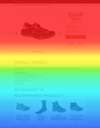
Only about 10% of visitors will make it all the way to the slot above the footer. Thus, the location of critical elements such as product details, videos, product recommendations, and customer reviews have to be very carefully considered. The lower a feature on the page, the lower viewer rate.
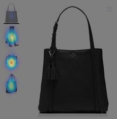
#2 Include alternate images
Product imagery is one of the most effective ways to demonstrate the details and quality of an item. Having an abundance of alternate images to support these details is important. The placement of the alternate images can influence the click rate of the thumbnails. For example, we know that images positioned to the left of the main image have an average click rate of 39.5% while thumbnails positioned below the main image get just under 8% click rate.
When we look at alternate images on mobile, we discover that presentation often impacts the likelihood of interaction. The use of arrows on the left and right side (indicating additional alternate images) had the highest interaction rate. Thumbnails beneath the main image performed almost as well. However, the use of dots underneath the main image to indicate swiping generate the least degree of interaction. Here are the click rates for mobile:
Arrows – 22.5%
Swatches – 21.5%
Dots – 5.7%
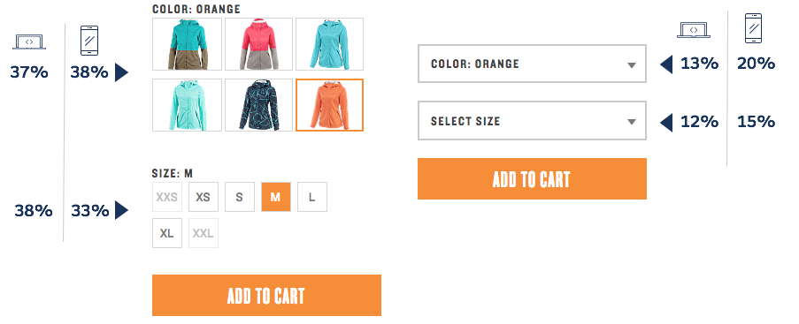
#3 Choose swatches over dropdowns
When it comes to selecting product attributes such as size and color, we see that swatches have a higher interaction rate than drop-downs. Swatches simply stand out more, and shoppers can quickly see the full range of colors and sizes. Using swatches also makes the availability for a particular size or color highly visible. Swatches require less interaction by the shopper to tell whether or not a product is in stock.
On the desktop, color and size attributes average a 38% click rate when they are displayed as swatches, and only 12% when drop-downs. For mobile, drop-downs performed slightly better at 17%, and swatches maintained at about 36% click rate. When we dug a little deeper into our data we saw an 11% average add-to-cart rate for swatches compared to just 5% for drop-downs. However, this is not to say drop-downs should never be used as a UX element over swatches. The complexity of a product and the number of attributes may lend itself to one over another.
#4 Create a strong call to action
“Add to Cart” is by far the most important button on your site. It must stand out. A common design pallet has a black header with a white content area and light grays as accent colors. There’s nothing wrong with these color combinations, but consider A/B testing colors that contrast the rest of the site. There is no “best” color, it’s not about “green vs red” and which one color yields higher conversions. Crucial calls to action should stand out from the rest of the site while complementing the overall color scheme. Brands have reported increases to their add to basket rates as high as 21% after A/B testing different colors.
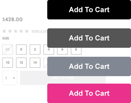
Other ways to make the calls to action stand out is to experiment with button size, shape, and position. Consider adding iconography such as plus symbols or shopping carts. Think about the copy on the button… “Add to Cart” or “Add to Cart NOW!” Get them excited about making a purchase.
Between product images, size and color attributes, pricing info, product ratings and so on, there are a lot of elements on the PDP. Make the call to action prominent. It does not have to be over the top but it should stand out.
#5 Keep it simple
Shoppers generally scan the copy on your site more than they actually read and absorb it. Make sure that your copy communicates who you are as a brand while still providing the essential information customers need to make a purchasing decision. Use bullet points to help shoppers digest important details quickly. Reduce visual noise and keep layouts simple; too often, layouts are overly designed, yielding a cluttered site stocked with needless and frivolous functionality. Of course, what might frivolous to one brand might add high value to another. It’s up to each brand to assess.
Keep in mind that not all of these recommendations will produce the same results. Be sure to continually conduct A/B testing, because what works on one site may not work on another. Understand who your shoppers are and get a grip on the unique manners of their shopping habits. As you build a strategy for optimizing your site, determine the metrics you will use to judge the results.
Want to learn more? Check out our next post in the series: UX Best Practices: How to Design a Better Homepage