
Collecting, sorting and analysing data are essential activities for every company, in every sector, in every type of business.
But regardless of how interesting, ground-breaking, and downright wonderful your data is, it runs the risk of remaining an incomprehensible and useless jumble if it isn’t presented and displayed in a way that’s easy to digest and understand.
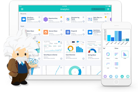
Tableau CRM: The Best Analytics for Salesforce, from Salesforce
Unlock the full power of Salesforce data with Tableau CRM. Tableau CRM is a purpose-built suite of apps for sales, service, and marketing. Get a full picture of your customers, your team, and your company.
This is where data visualisation comes in. So, what is data visualisation? In a nutshell, data visualisation can be defined as the art and science of arranging and presenting data in a way that is clear, concise, sensible and highly visually impactful.
In other words: it’s making your data look as good as its insights are.
In 2021, Stanford University posted an effective (and pretty amusing) image representing how data is processed – showing it develop from a pile of raw material to a useful product. Some data engineers might find it perfunctory or too high level – but it undoubtedly does a good job of getting the point across.
So, the important stuff.
How do you create data visualisations?
Regardless of which tool you use – classic bar graphs, pie or line charts, histograms, Cartesian maps or diagrams, or data presented within infographics, visuals or even videos – the aim is to make the data appealing, easy to understand, and easy to use.
Because when this happens, you can make better decisions, draw accurate conclusions, make new discoveries, and confirm insights and analysis. Essentially, you’re on your way to becoming a data-driven organisation.
The benefits of data visualisation
Effective data visualisation has a ton of different benefits.
But the most important ones?
Clearer understanding: The right visualisation gives you a near-instant read. You save time and you reduce the risk of misinterpretation. Meaning it’s possible to make decisions more easily and more effectively.
Improved communication: Data visualisation lets you communicate clearly with important stakeholders. (And because there are fewer words involved, you can appeal to those time-poor senior execs who just want an answer now.) Likewise, you can express your point of view in a convincing way – with solid evidence.
Greater credibility: Support your opinions, arguments, and hypotheses with clear, well-visualised data, and you’ll get greater credibility.
Ready to get the wow-factor from your data? See how Tableau can help you get more from your Salesforce investments.
Tableau CRM: The Best Analytics for Salesforce, from Salesforce
Unlock the full power of Salesforce data with Tableau CRM. Tableau CRM is a purpose-built suite of apps for sales, service, and marketing. Get a full picture of your customers, your team, and your company.


