Get your FREE 30-day trial.
Start by selecting a product:
Charts are the language of business, used every day at all levels to convey information. But too often, they consist of incomprehensible pies, bars, gauges, dots, and lines, leaving the reader no more informed about the topic at hand. The good news is it’s almost certainly not your fault — it’s the charts themselves.
I’ve been helping people build better charts for 15 years, through my book, The Big Book of Dashboards, on Chart Chat (a video series about the good and bad of data visualisation), and at conferences around the world. I’m a senior data evangelist at Salesforce’s analytics platform Tableau, and here’s what I know: data visualisation is a language as expressive as the written word, a language that needs to be understood by all but often is not.
I’m endlessly fascinated by the power of data to persuade or inform. Seemingly trivial choices such as colour or orientation can completely transform a chart’s message. Check out this two-minute video for a perfect example of how a simple bar chart can be manipulated to tell two completely different stories.
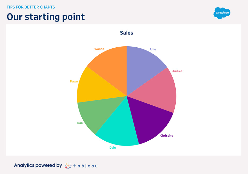
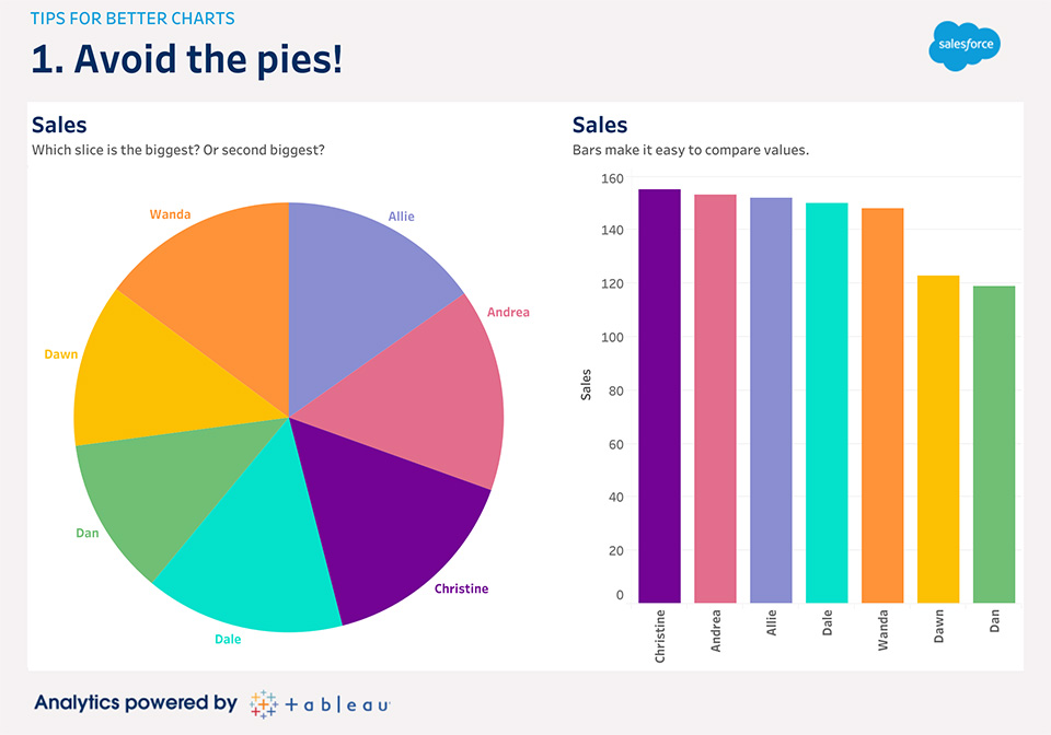
It’s not only easier when the data is shown in bars, your brain efficiently processes the bar chart on the right before you even consciously think about the data.
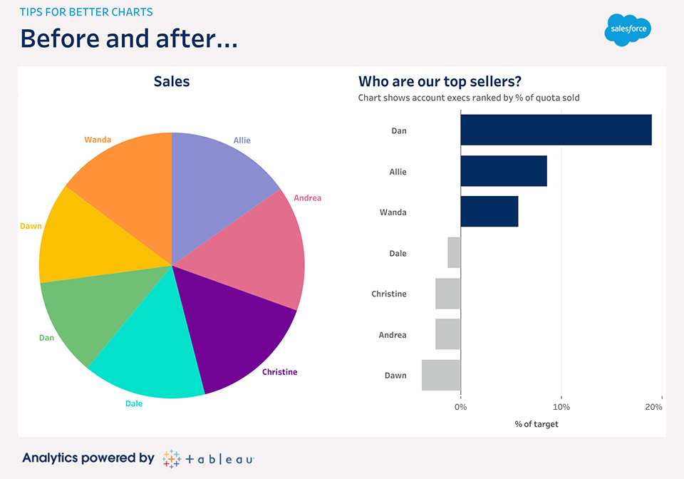
How can that be? Data visualisation takes advantage of “preattentive attributes.” These are environmental signals that we process subconsciously, and they’re super-useful. Length, colour, size, and angle are all examples of preattentive attributes. However, we process some more efficiently than others. Our brain is terrible at efficiently comparing sizes of slices in pies, but wonderfully efficient at perceiving even the smallest differences in lengths.
A chart should deliver its message in the most accurate way possible. Choosing the right preattentive attribute is a critical skill. Don’t just click the button that makes the most “attractive” chart. You should always think about whether the chart actually conveys the message you want it to.
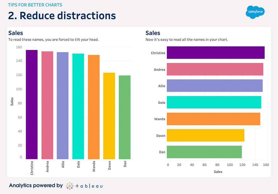
Avoid the temptation to use too many colours in your visualisations. In all analytics software, colours are just a click away, and it’s easy to feel productive by sprinkling some into your charts.
Take a step back. Is the purpose of your analytics to make pretty rainbows, or to share insights?
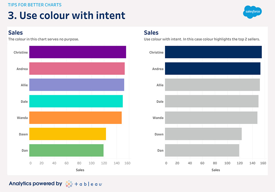
Some of the most powerful and effective charts use only one colour. In the below example, the multi colours used on the left serve no purpose. Readers might be confused as to what the different colours even signify. The example on the right is more effective in highlighting the intent, which is identifying the top two sellers.
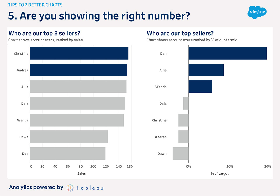
After choosing an appropriate chart, orienting it correctly, and using colour to highlight, you need to stop and think: what is this chart actually showing? What conclusion do I want people to draw from this chart?
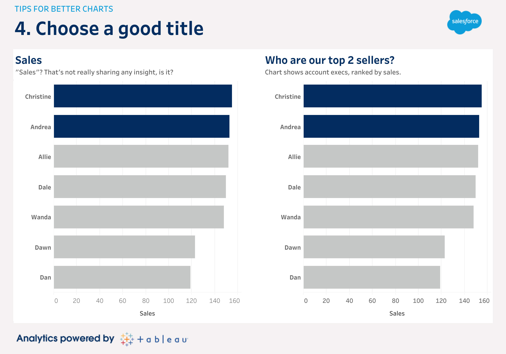
The first thing people look at on your chart, and the most likely thing they’ll remember, is the title. It’s the one chance you get to tell them what they’re going to see and suggest the insight you want them to take away. A good title should describe the insight the chart shows — this could be in the form of a short phrase or question. Getting in the habit of making good titles also forces you to be sure you know why you are making the chart in the first place.
In this example, I’ve created an effective 2-level title on the right. This allows a clear intro (“Who are our top 2 sellers?”) with a sub-heading for added context.
Get insights 29% faster with analytics*. Learn to interpret, explore, and communicate effectively and efficiently with data.
Drive your business growth with data analytics. Learn the data and analytics trends and insights shaping the digital marketing landscape.
This post originally appeared on the U.S.-version of the Salesforce blog.